I really don’t like the design of the progress pride flag, and I couldn’t really put my finger on it until I saw this: https://nava.org/good-flag-bad-flag
For reference, here is the flag I’m referencing as “bad flag”:

And here is the original:

So, the original has too many colors, but it’s the colors of the rainbow. In order. It’s recognizable from really far away, and it’s dead simple to draw.
With the Intersex flag, that’s 14 colors. There are three shades of “purple”. The circle won’t be visible from far away. The chevrons are too thin to be very recognizable from far away.
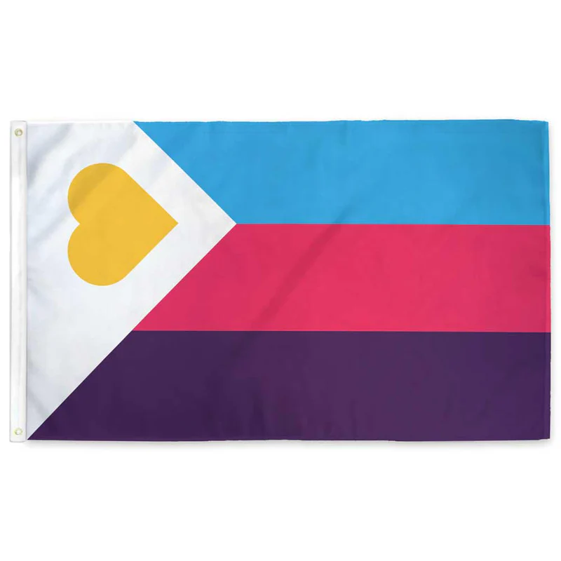
It’s not like there aren’t good pride flags. Like there are AMAZING ones:


Edit:
In case you don’t know what these are: https://flagsforgood.com/collections/pride-flags


Thats way too busy. Should definitely just keep the rainbow flag. Not every little niche needs specific representation, just have the rainbow as a catchall for any kind of deviation from heterosex
Edit to add : if they want to use them to identify and specify within rallies or amongst themselves somehow then whatever, go for it, as long as we can accept the layman isnt gonna have a clue and cant really be expected to.
I thought the rainbow was supposed to mean it encompassed everyone.
The colours on the flag apparently weren’t sufficiently inclusive so perhaps this should be the next flag:
this fails to capture the grades of saturation.
Here is every color in the RGB (#000000-#FFFFFF) color space arranged sequentially on a Hilbert curve (but scaled down to 512x512)
coool
there are a lot of pieces that use one pixel per color too! you might really dig what people can do with it: it’s honestly astonishing the kinds of arrangements they can make just by mixing the colors.
https://allrgb.com/
cool!
I would absolutely and unironically fly this flag, although to be even more inclusive it also needs an alpha layer. Perhaps it should be a cube? Actually even that might not be inclusive enough, we need more dimensions. BRB I need to figure out how to attach a tesseract to my flagpole, I guess I’ll need some kind of gordian knot?
I was thinking more adding from outside the visible spectrum. So a flag with the entire electromagnetic spectrum from ~10^-20 m to ~10^17 m
Black and white are pretty overrepresented there though. Turning this into a sphere might help?
I call Lime Green as my personal inclusion color!!!
Wasn’t the entire idea of the rainbow flag to just say “this includes everyone”, to be inclusive?
Then people started “well red is this, yellow is that, green is that …” Making the entire thing as exclusive as can be, now requiring a color and or symbol for each and every tiny different identity they were trying to be
Imo, the rainbow flag is perfectly inclusive. By focusing on one minority, you make it less diverse and less inclusive.
Rainbow flag is best
They all sprung up in that period where flags were trendy. Every little camp had to have one to feel like a singled-out tribe—and, no, this isn’t just kink flags. This meant many would be flag designers overnight.
The result is there’s some really fugly designs out there in the wild now and the idiots can’t go back. But most people are over flag phase now, so you’re unlikely to ever see this and most others out in the wild.
Nothing fails more at its job than a pride flag that people have no idea what is. It’s almost irony.
And is this one ugly? Oh, yes. Enough to turn a person straight.
Totally normal words to say. BTW trans and intersex people can still be straight.
Better get it on the flag then ig
Here’s the thing though, I know this is an ally flag, but it’s like they never considered symbols:
Ignore the really bad black and white background for a second.
Imagine the left side of the shape is an homage to the original pride flag and the right side is WHATEVER YOU WANT TO PUT IN IT. Uniform clean design with representation. Easy to draw for the layman (fill both sides in with rainbow if you want), and easy to add specific representation